Space, Storage, and Style Upgrades
The
Vision
A Spacious Home Where People Want To Hang Out
These homeowners knew that giving their kitchen a makeover would be a big undertaking, so they contacted our team for reinforcements. Their main complaint was that their kitchen felt cramped and needed more storage, cooking, and entertaining space. They felt that their kitchen should be a room where people enjoy spending time and actually want to be – and we couldn’t agree more!
In addition to their kitchen, the homeowners also wanted to upgrade their front entryway. They felt it didn’t make a great first impression upon entering their home, and it just wasn’t serving a good purpose – they knew it was capable of more. We discussed ways to add more space to the area and make it a functional mudroom while adding some gorgeous design elements. That said, they were on board and ready for us to get to work!
Project Goals
Open and Operational Rooms That Bring Joy
The homeowners knew that this project would be a heavy lift, but they were ready to get started and we were ready to make a home that their friends and family would rave about.
Kitchen Updates
- Create more countertop space without making the room feel cramped.
- Improve the functionality of the kitchen.
- Utilize the large dining room at the back of the home that’s rarely used to add square footage to the kitchen.
- Add natural light to the space and make it feel more open.
Mudroom Makeover
- Create a functional yet aesthetically pleasing front entrance to the home.
- Combine their current entryway and foyer into one clutter-free space.
- Make room for muddy boots, winter coats, and sports supplies to be stored without jeopardizing the style of the area.
Renovation Challenges
Adding More Space (Without Adding More Space)
The main challenge for updating the kitchen and mudroom in this home was that the homeowners wanted to open up the spaces without expanding the home’s footprint. They were searching for a way to make their house feel larger and work better for them without adding any additions to the property.
In fact, the homeowners were originally going to build an addition on the house, but they put it on hold for now and are considering doing it later down the road instead. The remodel was designed and planned out carefully so it will not disrupt any of the newly-built space. Based on their vision, Meadowlark helped to determine the scope of work that accomplished their current project priorities and designed a phased approach for the future.
In addition, it was super important to them that we created spaces that would provide an inviting vibe where people want to hang out, rather than an area that feels like a chore to spend time in. Luckily for these homeowners, we know how to make the best architectural design choices while keeping functionality and aesthetics in mind.

Design Selections
Here’s how we took our homeowners’ requests and made them a reality.
Kitchen:
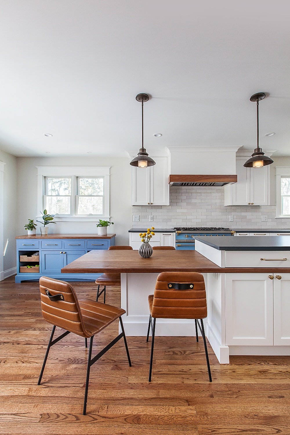
- The kitchen was combined with the dining room to create a kitchen with more space, natural light, circulation, storage, and working spaces
- Built-in spice drawer
- Pull-out utensil cabinet with a built-in knife holder
- Expansive island featuring rich walnut custom trim, adding to the new white and blue-gray color scheme
- Vent hood with walnut accents to complement the built-in bookcase of the island, resulting in a unified look
- Encore Frameless “Madison” Crystal Cabinetry painted white to amplify the natural light
- Hubbardton Forge textured steel and glass pendants to anchor the island.
- Custom-built Crystal Cabinetry buffet with walnut drawers for vegetable storage, painted to match the Lacanche custom-colored enamel range
Mudroom:
- Wall-to-wall custom built-ins with Crystal Keyline Inset cabinetry, providing organization without sacrificing style
- A bench was added for additional functionality and storage space, with nifty drawers underneath for hats and gloves, a designated shoe area, and cabinets to tuck away the dog’s food and treats and other odds and ends
- Millwork was added to elevate the room
- Hooks were installed for even more convenient storage options
Standout Brands
Quality Products That Make A Statement
When brainstorming new storage solutions for the home, we knew that the best choice was Crystal Cabinetry. We designed wall-to-wall custom built-in cabinets with the Crystal Keyline Inset Collection, which provided the organization the needed paired with the style they were searching for.
We also created a custom-built Crystal Cabinetry buffet that offered storage space for produce. We incorporated rich walnut features and blue paint to match the stunning range that had been installed.
In addition to the one-of-a-kind custom cabinets, we installed a Lacanche range, SubZero refrigerator, and Hubbardton Forge pendants over island and dining table. Lacanche is known for incorporating traditional French styles with contemporary charm, and we just couldn’t be happier with the result.
The
Results
A Functional Home With Space to Make Memories
By combining areas in the home, we accomplished the goal of creating larger, more functional rooms without increasing the property's actual size. We incorporated custom cabinetry solutions that not only added to the flow of the rooms, but also added storage and purpose.
This project was such a success, that it was even featured in two Houzz articles! Our team is so proud.
At the end of the project, the homeowners were thrilled with the results. They were left with a home that made a fantastic first impression, provided ample storage solutions, and exuded positive energy and joy. It doesn’t get any better than that!

