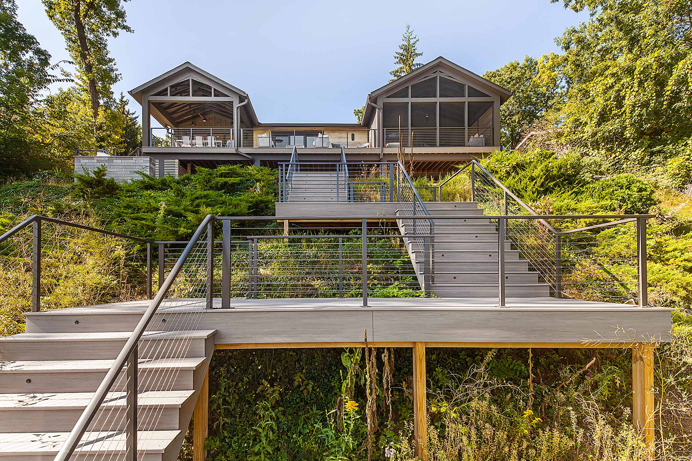
The vision for this project was to create and expand a comfortable and useful exterior space with a light and transparent structure, while keeping the natural debris and elements at bay so the space would be more inviting year-round, inside and out. There was also a strong desire to balance the unique exterior forms of the home.
The structure was designed to be minimalist, in the spirit of the home itself, with materials that were exposed in their useful form – glass, steel, and light wood decking. Sustainability and beauty of materials were an important goal of the client.
Design & Architecture: PLY+
Project Manager: Doug Selby
Photography: Sean Carter
Awards:
2018 Master Design Award - Outdoor Living Category
2018 Chrysalis Regional Award - Best Residential Exterior Category
Balancing the weight of the major architectural forms on the exterior and making this area of the home feel inviting required some design finesse to fit with this classic mid-century modern home. Key design goals:
Extending the structure into the yard worked with the original design of the home and extended the outdoor space into the beautiful forested lot. Using a cantilevered design and minimal structural elements provided a well-ventilated structure that seems to float into the backyard and has just enough visual weight to create a balance between the two major exterior forms. The steel beams were left exposed for both on-going maintenance, and to heighten contrast and create a counterweight to the glass walls and ceiling. A glass door system creates a visual connection to the outside and floods the interior with natural light.
Providing a cover over the upper deck achieved two major goals. The first was keeping natural debris from accumulating in the alcove, a problem for this forested lot where breezes would often sweep up the hill. The second was to create a feeling of protection and enclosure – less like a deck and more like an exterior room. A solid cover was not desirable because the lack of natural light would make the area dark and uninviting.
A normal glass covering would not be structurally sufficient and would create a heat island in the summertime. A product invented and manufactured at the University of Michigan’s Taubman Center for Architectural and Urban Design, Situmbra, was a perfect solution. A composite glass material, it is lightweight, strong, insulating, and allows dappled light through. Likewise, a glass railing was used to surround the deck, completing the transparent effect. The unique Situmbra roof structure utilizes passive solar technology to maximize sunlight onto the deck while at the same time minimizing the associated solar heat gain. It also allows for protection from the rain allowing the occupants to enjoy the deck even on rainy days.
The folding NanaWall door system opens up the living area inside the home, providing much-needed natural light in what was formerly a darkened corner of the home. Because the Situmbra roof allows most light to penetrate while creating almost a prismatic effect, the light has a quality that enhances the mood of a transitional seating area. There is a strong sense that the area beyond is more like a room than a deck, sheltered and yet open and natural.
The new outdoor structure works perfectly to update and balance the rear exterior of the home while creating a comfortable outdoor living space that seamlessly transitions from inside to out. The stairs are the only physical connection between the living space and the yard below. The sense of floating in the trees that this affords cannot be captured entirely in photographs. The black of the steel frame provides a much-needed connection between the two exterior forms of the home and is a welcomed facelift to the homes rear façade. Extending past the plane of the home helps visually anchor the two wings of the home while the glass nature of the structure does not overwhelm those forms.
Modernizing a mid-century modern architectural gem is a risky business. Form and function must be balanced perfectly, and challenges imposed by a Michigan climate must be factored into the design equation. This stunning redesign of an outdoor space sought to update a tired and uninviting portion of this David Osler designed home. Overlooking a magnificent natural view, this new cantilevered steel and glass structure has created a comfortable and compelling outdoor space that balances the existing exterior forms of the home. Cutting edge materials and an elegant design complete this one-of-a-kind transformation of this architecturally significant home.