SAYING GOODBYE TO THE '90S
We're sure that for many of you the 1990's bring back fond memories, but if your home is the perfect example of "all things 1990's" then maybe it's time to think about the possibilities for bringing your home into the 21st Century.

When we think back on all those kitchen features that we were drawn to in the 1990's - like dark-stained wood cabinetry, black granite countertops and angled features that allegedly added "interest" to the design space - we now understand why they have been pushed aside.
Our clients come to us yearning for lighter and brighter finishes that feel clean and welcoming. They are also looking for design strategies to make every square inch of their homes work better for them. The idea of wasting space just to create "interest" no longer makes sense and the mantra of "form meeting function" is the underlying driver in today's renovations.
ADDING FUNCTION WITHOUT ADDING SQUARE FOOTAGE
For this kitchen remodeling project our clients came to us with a desire to breath some fresh air into their kitchen space. They loved the home and the neighborhood and were planning on staying there for a long time. The clients had grown tired of the dark spaces and the chopped up work areas. They also loved to entertain so opening up the kitchen to the adjoining family room and to the beautiful back yard was also a key design consideration.

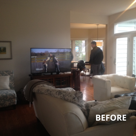
The existing kitchen had plenty of square footage but it just wasn't configured to its best advantage. A partial wall between the kitchen and the family room boxed in both the kitchen and the adjoining family room. The angled island was narrow and sucked up more space in the kitchen than it needed to. Its narrow width also limited the useable counter space - it was for all practical purposes - just a wasted kitchen appendage.
The kitchen also had a hallway adjoining it on one side with a doorway that took up valuable square footage and wall space. Our designers knew there was potential to better utilize the flow in this kitchen to maximize it's function.
Our clients' wish list included:
-
Open up the kitchen to the adjoining family room
-
Lighter, cleaner finishes
-
Create a large island that would work for the family and for entertaining
-
An organized drop zone/desk area
-
A breakfast area
-
More storage
-
More connection to their beautiful back yard
-
Maintain the traditional design aesthetic of the home
FORM MEETING FUNCTION
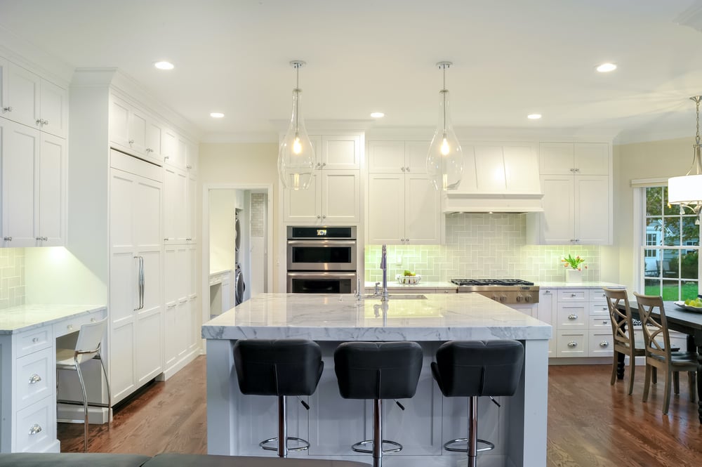
Our designers listened to how our clients used the space to learn what was working and what wasn't to come up with a plan for the redesign. Their goal was to utilize the existing square footage and come up with a newly remodeled kitchen that would be transformational not only in how it functions for the family, but also in how it looks and feels.
The removal of the surrounding walls opens the space to the adjoining family room area - bringing in loads of natural daylight. A large center island with a Statuario white polished slab marble countertop provides plenty of room for seating, storage and work area. A built in seating area with storage now frames the bay window and offers the perfect spot for that morning cup of coffee while watching the birds outside. A work station/drop zone utilizes custom cabinetry that seamlessly integrates into the kitchen design. Finally white shaker cabinets and lighter, classic finishes keep the traditional aesthetic and create a kitchen that beckons you into the space.
You can find more details about this kitchen remodel and also the adjoining laundry/mudroom remodel we completed at the same time on our website.
Are you ready to bring your '90s kitchen into the 21st Century? Let our designers help you transform your space.
The first step is easy.
Fill out our contact form or call us at 734-332-1500.
We'd love to talk about possibilities!
