How to Create a Pet-Friendly Mudroom Remodel
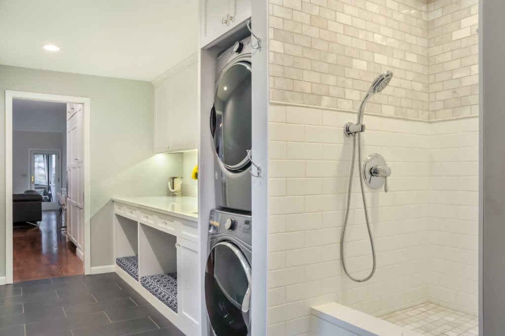
At Meadowlark Design+Build, we’ve had quite a few mudroom remodels and custom home projects that focused not only on the needs of the client’s family...
3 min read
Meadowlark Design+Build : Jul 18, 2021
The majority of the production homes built in the late 1990's and early 2000's had a list of design features that were considered desirable: Formal dining and living rooms, kitchens with floor-to ceiling dark cabinetry and countertops, and laundry/mudrooms close to the garage entry. Some of these were really great ideas if executed properly, others just wasted square footage begging for remodeling.
Case in point...a recent client reached out to explore various options to remodel the main floor of their 2004-built home. They wanted to update the rooms to match their aesthetic and style, and wished for a more functional and comfortable space where they could entertain family and friends.
The kitchen felt dark and isolated from the adjoining family room and sunroom, and the eat-in kitchen space, (which they used all the time), was cramped. Ironically, the home had a separate formal dining room next to the kitchen, but it was never used except as a playroom for the kids. Even when entertaining, they found their guests gravitated to the kitchen area - leaving the living and dining room completely forgotten.
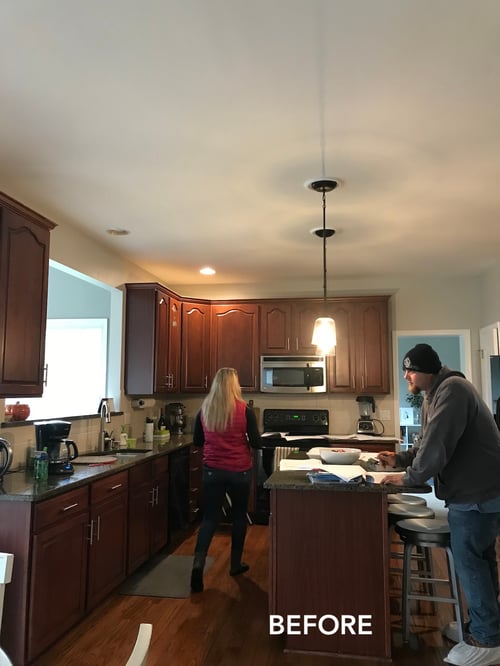
The kitchen was located in the center of the house and thus had no exterior walls for windows to look out into the beautiful backyard and to let in natural daylight. There was a pass-thru opening into a sunroom, but no direct connection visually to the outside.
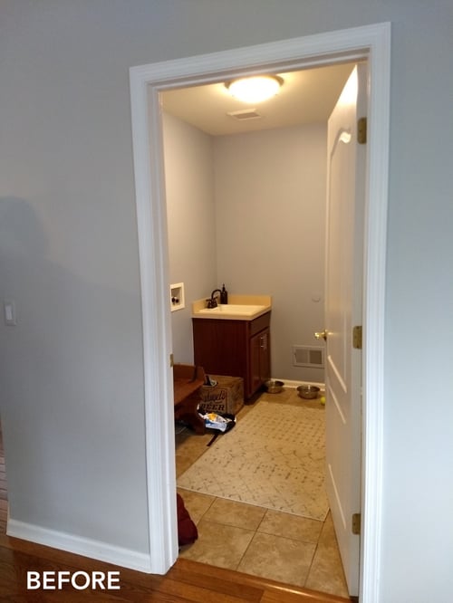
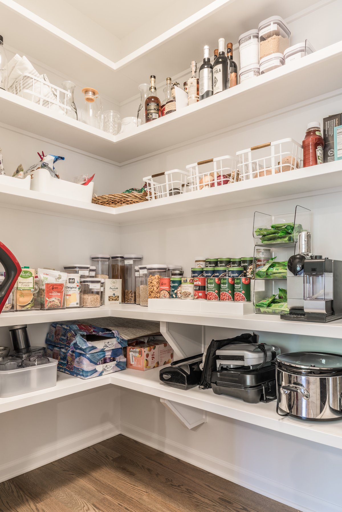
To add to the poorly functioning first floor - they were lacking in storage. They longed for a larger walk-in pantry which would provide additional storage and be a dedicated place for countertop appliances that weren't used on a daily basis. The mudroom, originally designed as a very small laundry room (the laundry had been relocated to another part of the home), was also a sore spot for them as it had no storage and couldn't manage the day-to-day comings and goings of a family of 4 with pets.
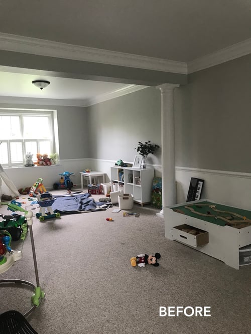
The current formal dining and living rooms where delineated by two support columns in the middle of the space. It was a long, dark rectangular room with only two windows at the front and back of the home. Aside from being a great playroom for the kids and their toys - It soaked up significant square footage (approximately a third of the total first floor space!).
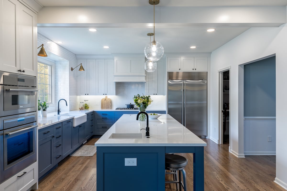
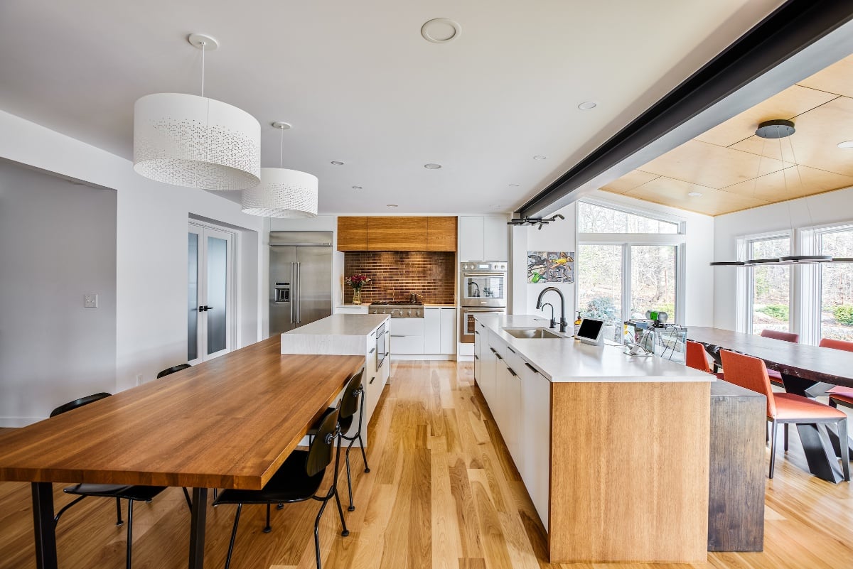
By reconfiguring the existing footprint, Meadowlark designed a large kitchen and entertaining space. The scope of the project involved taking down the dining room wall and expanding into the dining room, which created a much larger kitchen. A new enlarged opening to the sunroom was built and opened up the dining space and eliminated the cramped feeling. The half wall into the family room was also removed.
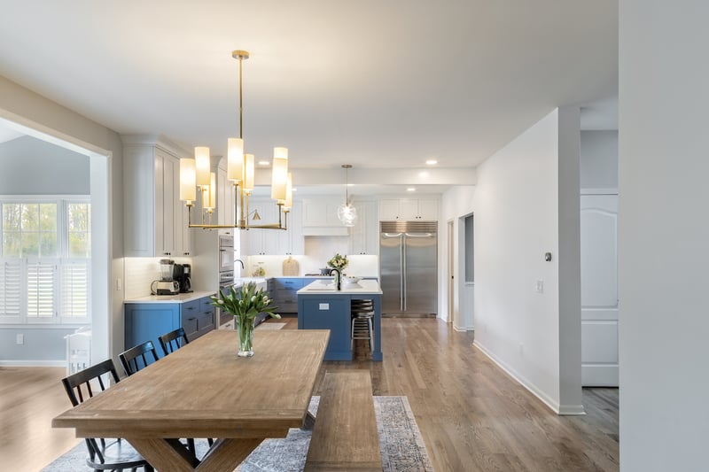
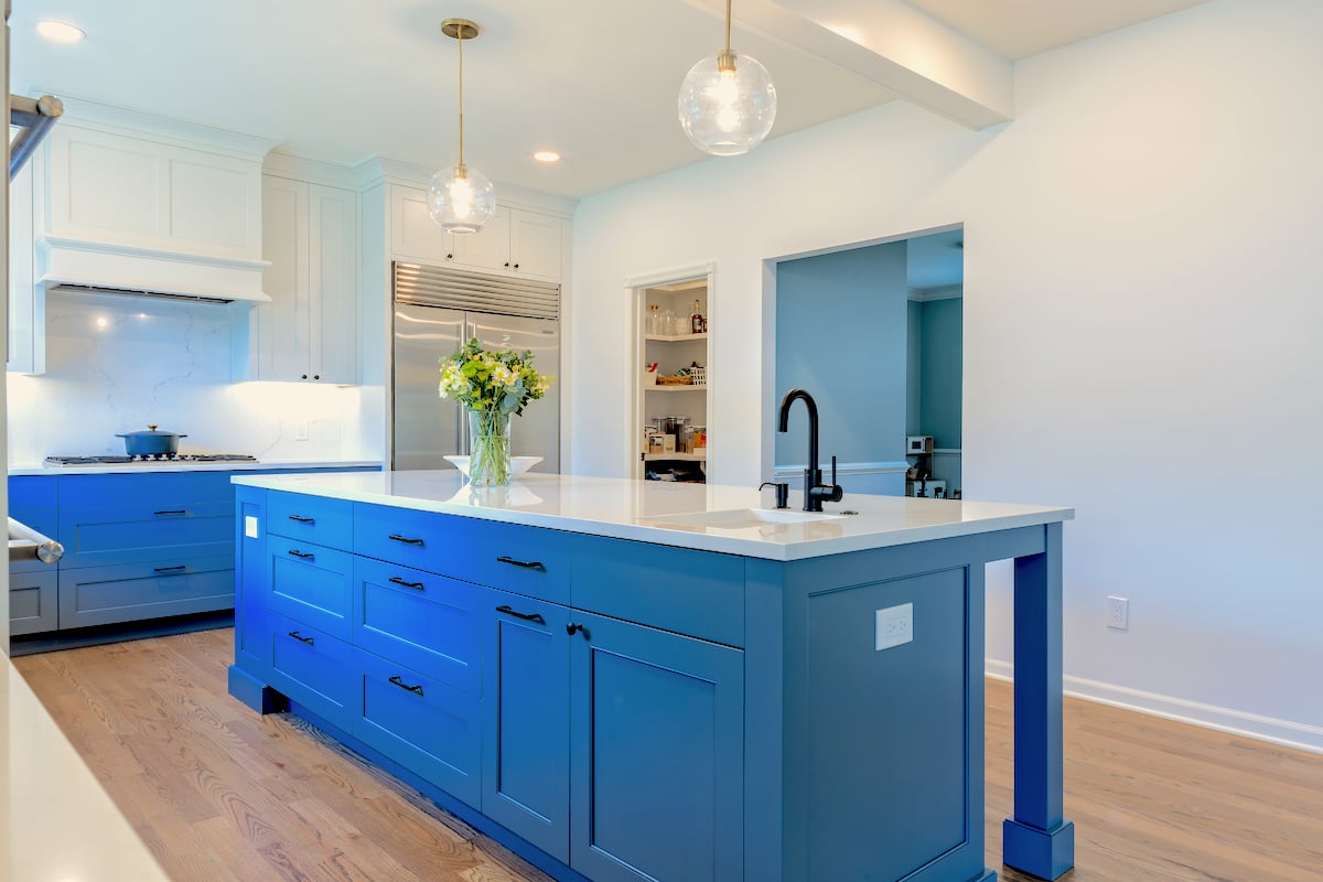
The large island became the main gathering space, with one side dedicated as a prep area with a handy prep sink and the other side devoted to seating. The working side of the island functions with the opposite kitchen counter and large farmhouse sink, and the paneled hidden dishwasher and garbage/recycling bins. The island also provides sufficient space opposite the fridge making it easy to put away groceries and equally for grabbing items to prepare for cooking with the nearby stove top.
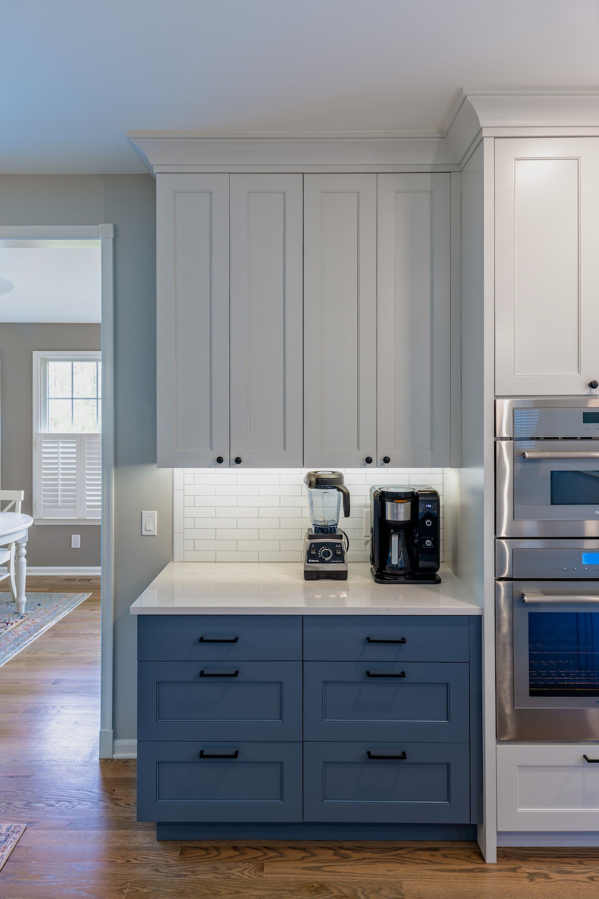
A separate area for morning smoothies and coffee was created, and the use of drawers rather than cabinets allow for a more practical and ergonomic space. A docking drawer was added to help eliminate clutter on the counters.
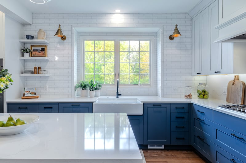
The large cast iron farmhouse kitchen sink now sits under a new double casement window that now not only brings is loads of natural daylight, but also provides a direct view to the beautiful backyard spaces. The black matte faucet coordinates with the cabinet knobs and pulls giving a modern yet understated appearance, and the brass barn-light sconces are the perfect "cherry on top of the cake."
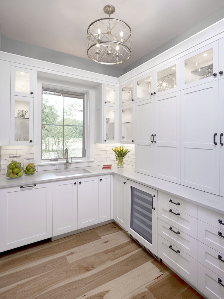
By capturing some of the space from the living room, a large walk-in pantry was able to be created off the kitchen. The remaining living room space was reconfigured into a playroom for the kids that could be easily blocked off when entertaining.
The clients needed a functional drop space when entering the house from the garage. The existing mudroom was originally designed as the laundry room but the homeowners had already relocated the washer and dryer to the basement although the utility sink remained. Meadowlark turned this awkward and small entryway into a valuable space with a place to store coats, backpacks, hats and gloves.
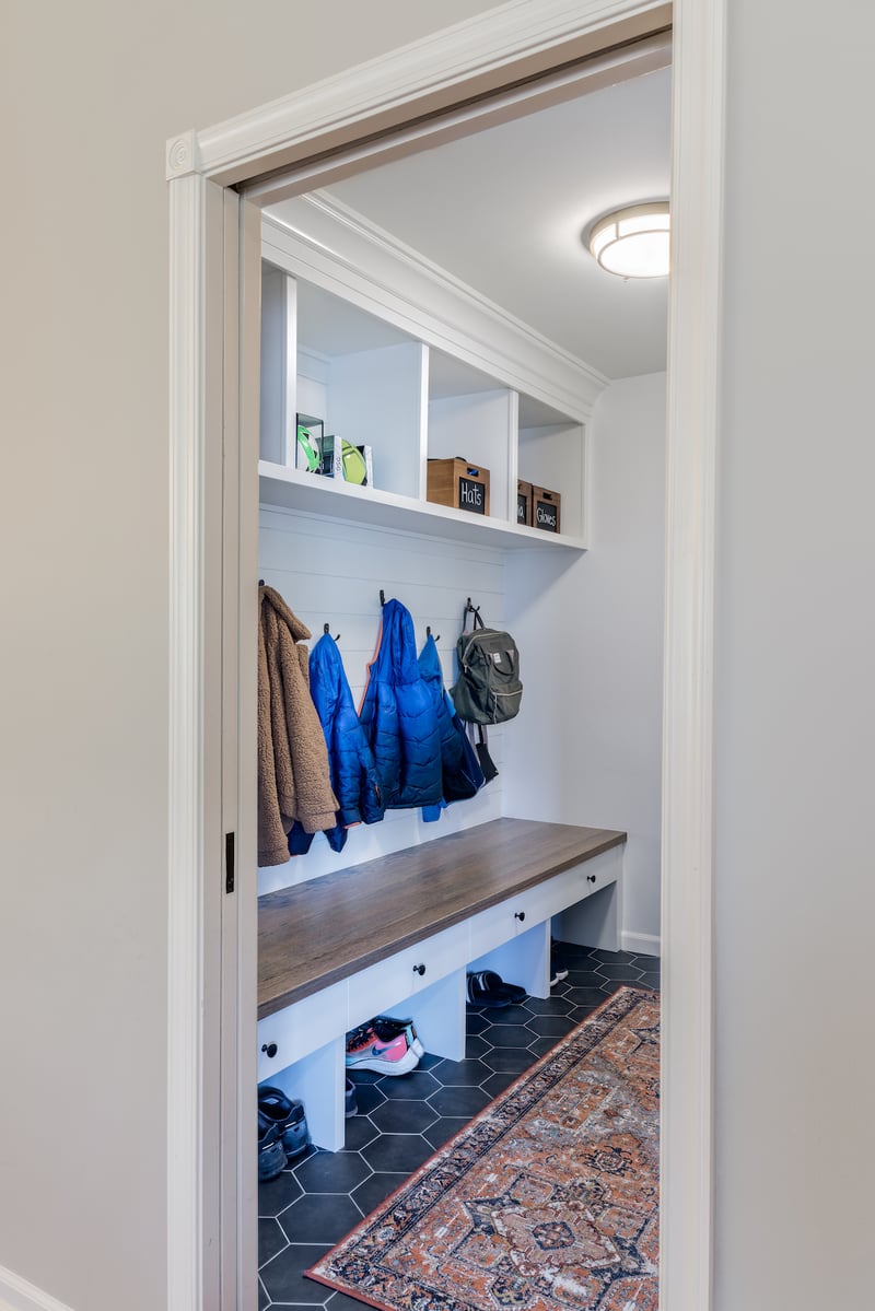
The space was made accessible for the kids by making the drawers accessible and at a low height. The bench becomes a place to take off or put on shoes/boots and allows the kids to hang up coats on the hooks so they don’t end up on the floor.
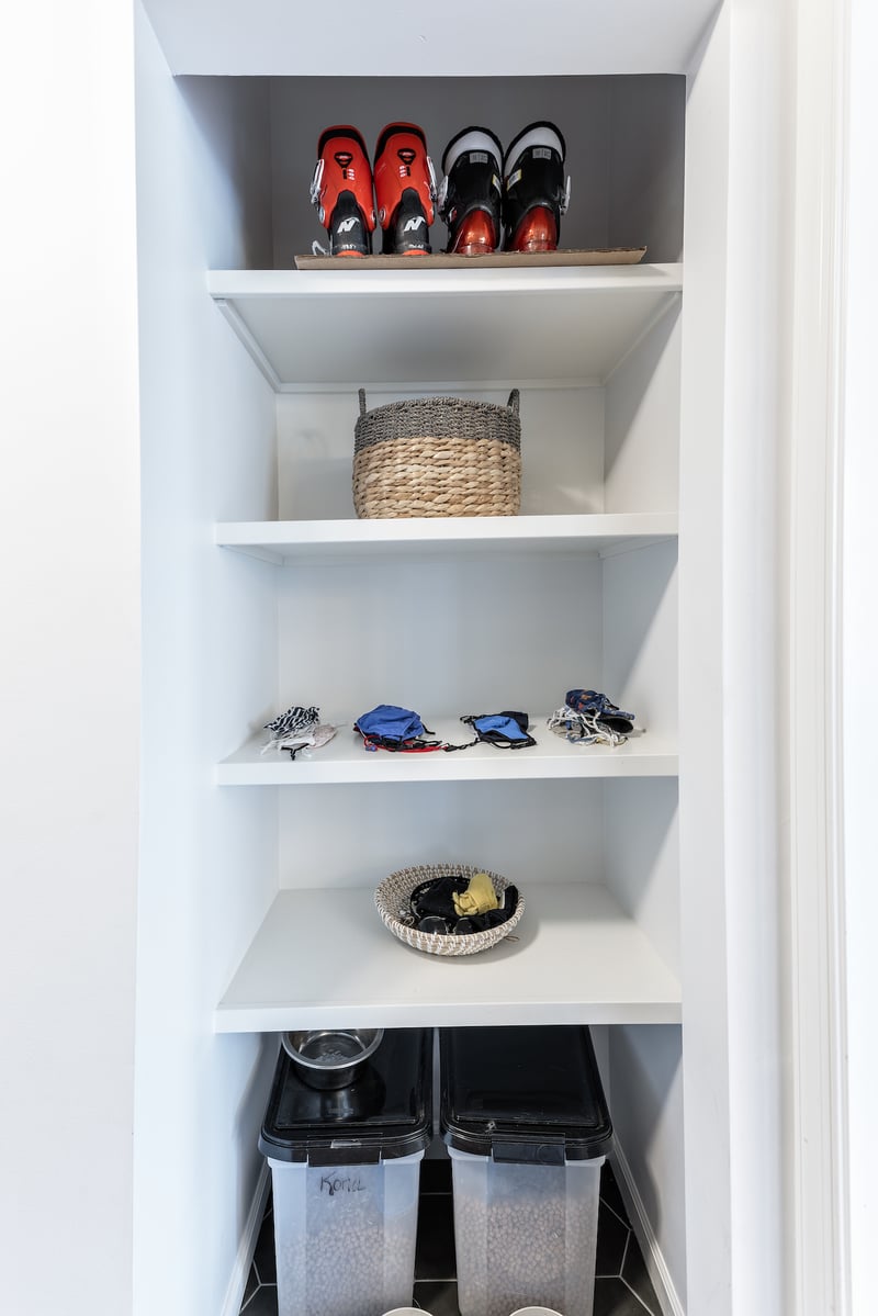
The small closet was turned into a storage space with shelving to stow everything from dog food and supplies to sports equipment. A pocket door was installed allowing the mudroom to be closed off and eliminating the need for a traditional door that swings open and close which takes up space. Clever mudroom design can have a big impact on managing the clutter in your home.
Our clients loved their home and the neighborhood and knew there was potential to make the home work better for their needs. The reconfigured floorplan makes sense for how they live in the home and the clean, bright aesthetic reflects their style, not a current kitchen trend.
Imaginative and collaborative planning on how to best maximize the space resulted in a more functional and personalized design for our clients.
And that's what we're all about.
Thinking about the possibilities for your "turn-of-the-century" home? We'd love to start the conversation.
At Meadowlark Design+Build, we’ve had quite a few mudroom remodels and custom home projects that focused not only on the needs of the client’s family...
If you have two cooks in the family, you know that it can be difficult to prepare your spécialité de la maison, or any other dish for that matter,...
A Place for Everything and Everything in its Place Kitchen storage is always one of the key drivers for many of our kitchen remodels. Keeping things...