1 min read
Riding the Renovation Rollercoaster: The Emotions Behind a Remodel
Every home remodeling journey comes with its own set of emotions, and no project is without its ups and downs. After remodeling homes in the greater...
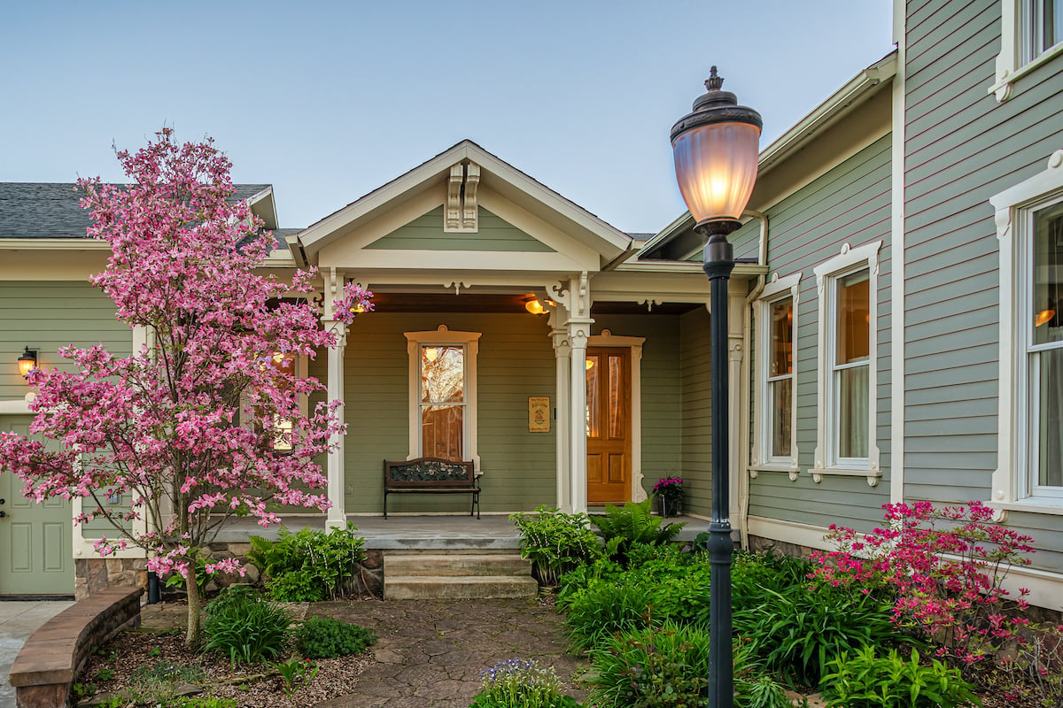
It's October 13, 2021...and most of the major paint manufacturers have already announced their "Color of the Year." Benjamin Moore seems to be the last to announce and according to their website they will be doing it at 2:00 pm EDT today. (Stay tuned...)
At Meadowlark we all look forward to these declarations — not only because we are always interested in new ideas and perspectives (which we are), but also because it's so much fun to see how the paint companies "spin" the colors and use them with others. Often the colors are just a retake on an old favorite that's repackaged with other colors, other times it's just completely way out there — unexpected and off the rails.
Color can be transformative and it's the easiest and least expensive way to change how a space looks and feels. If you're a DIY'er then grab a can of paint and change your world (or at least the room you're in!)
Here are the colors from the various paint companies for 2022:
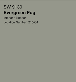
Credit Sherwin-Williams.com
We can say that the best part of these yearly color announcements is the descriptives the companies offer up when they present their selections. Here's what Sherwin Williams is saying about Evergreen Fog:
Evergreen Fog SW 9130 is a versatile and calming hue, a chameleon color of gorgeous green-meets-gray, with just a bit of blue. It's a simple but sophisticated wash of beautiful, organic color for spaces that crave a subtle yet stunning statement shade.
And they even have a video to introduce the color to the world. Whether you love it or hate it (or something in between), we do love the fact that they also give you colors to pair with it:
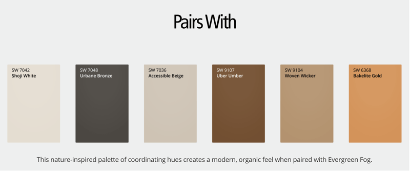 Credit Sherwin-Williams.com
And if you're still completely baffled and have some time on your hands — Sherwin Williams has this great Colorsnap® Visualizer where you pick a room and you can change out the colors and see how it changes the look and feel of the room.
 Credit hgtvhomebysherwinwilliams.com
Sherwin Williams HGTV line of paints (sold at Lowe's) declares their color pick for 2022 - Aleutian.
They offer this descriptive:
Create space for refuge with this perfectly balanced washed indigo that sets a restful tone. Because it's grounded in both warm and cool tones, it brings relaxation to any room.
As for pairings here is what they suggest:
 Credit hgtvhomebysherwinwilliams.com
It's a nice change from the greenish/grays we are seeing (read on) and it pairs nicely with light neutrals and can work well with rich, dark accent colors.
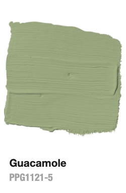 Credit PPGpaints.com
Glidden's take on the color of the year is another green - Guacamole. They don't offer us much in the way of pairings, but they have a light-hearted descriptive that makes us want to look at the color even if we're not a fan of green:
This spirited yet soothing green brings an organic energy to any space, which is needed because we all know you’ve probably killed at least three plants this year.
 Credit Behr.com
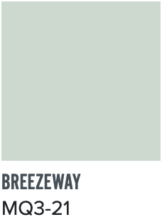
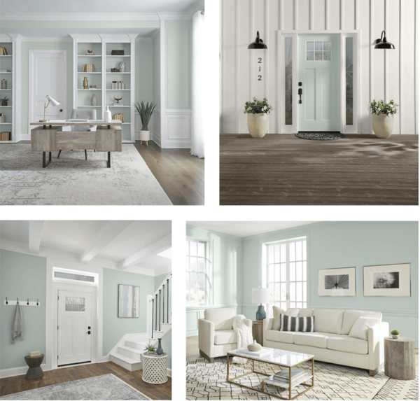
Yet another permutation of bluish/grayish/greenish hues (are we seeing a trend here?). Behr's Breezeway seems a bit softer than the others, and as Erika Woelfel, Vice President of Color and Creative Services, explains this color has been "inspired by naturally stunning sea glass." Behr also has a video to present the color and here's Behr's descriptive.
Looking ahead to 2022, we have a desire to embrace a sense of renewal and to explore new hobbies or adventures, both near and far, that excite us. The BEHR® 2022 Color of the Year, Breezeway MQ3-21, evokes feelings of coolness and peace while representing a desire to move forward and discover newfound passions.
 Credit Behr.com
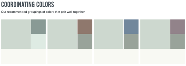
And they offer up these coordinating colors. You can find the color specifics on the coordinating colors by visiting the Behr Breezeway page.
 Credit Behr.com
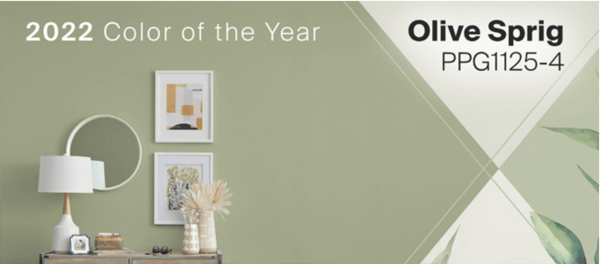
Another green (yes - we are definitely seeing a trend!). PPG brings a green shade that's a bit different from the others.
 Credit PPG.com
According to PPG: This sophisticated grey-green represents healing, regrowth and resiliency post-pandemic. Olive Sprig is a relaxed, but enticing green that emulates the feeling of soothing aloe vera or a fragrant plant – brightening any space with organic liveliness. A versatile color that lives well inside or outside, Olive Sprig blends in with nearly any environment.
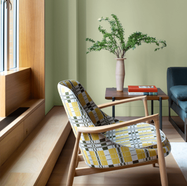 Credit PPG.com
PPG doesn't really offer up much in the way of a coordinating color palette, but you can check out their Olive Sprig website page and see suggestions on coordinating trim, accent and ceiling colors.
Valspar doesn't commit itself to one color, but comes up with a vibrant collection of 12 colors that run the gamut from yellow to peach to beige to dark blue to dark (almost black) brown. And yes..there is a green in there!
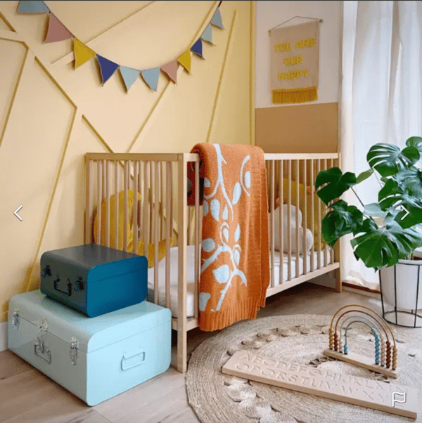 Credit Valspar.com
Valspar's descriptive is in line with all the others: The colors of 2022 come from nature, each bringing a calm, comfortable presence into your home.
Here are just a few of the colors:
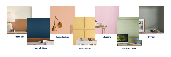 Credit Valspar.com
We waited patiently and were online for the live Benjamin Moore COTY (Color of the Year) event at 2:00 pm today. After having reviewed all of the other company's chosen colors — we were hoping that Benjamin Moore would step outside the box a bit and surprise us with something that was not greenish/grayish/bluish. Unfortunately, we were a bit disappointed as Benjamin Moore jumped on the bandwagon and selected October Mist - a greenish gray.
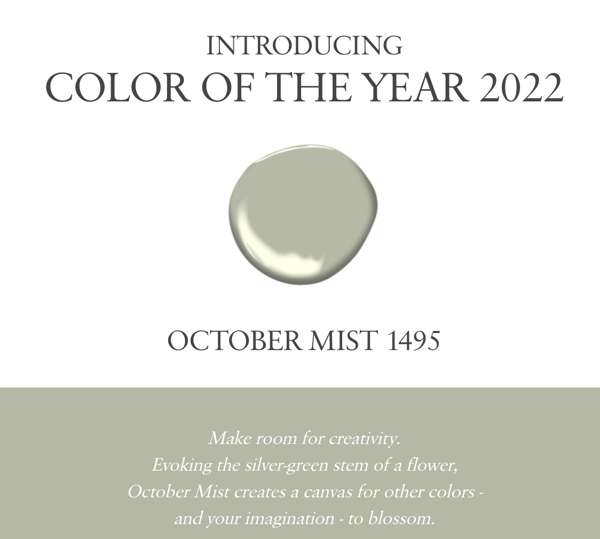 Credit: BenjaminMoore.com
It is a nice neutral color that we can see complementing many different styles and settings, but we all kinda were secretly hoping for something different from all the others.
Needless to say, we are seeing a push away from the colder grayish hues of the past decade and leaning towards warmer hues. And to give Benjamin Moore much deserved kudos — the coordinating color palette is really very nice!
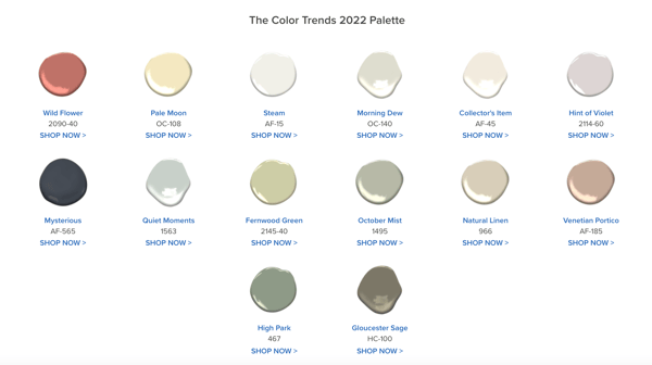 Credit BenjaminMoore.com
It's fun for us to watch for these trends come out every year. Like everyone else — we all long for a fresh start, new ideas and inspiration, and even a change of pace. However, color is a very personal choice, what is calming and comforting to you could look dirty and drab to someone else. In addition, lighting can play a huge role in how a color looks in any given application.
When choosing paint colors, don't be swayed by what is currently trending. Look at your furnishings, existing finishes and whatever brings you joy to find inspiration. And if that doesn't work then you can always find a designer to help you choose.
If you're looking to make some major changes at your home, give us a call at 734-332-1500 or contact us online. We'd love to start a conversation.

1 min read
Every home remodeling journey comes with its own set of emotions, and no project is without its ups and downs. After remodeling homes in the greater...
Transforming your home is not just about aesthetics; it's about finding solutions that fit your budget and lifestyle. When upgrading your kitchen or...
We’re thrilled to be featured in The Scout’s Guide’s latest piece, “How to Upgrade Your Basement, According to the Experts.” We invite you to check...